Platform on new construction, renovation, restoration and transformation
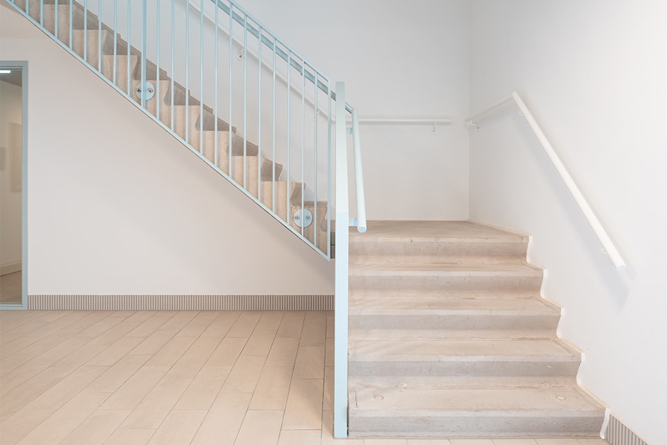
The architect had a clear request. The stairs and landings at Seasons de Trappenberg were not to be painted the standard concrete gray. Instead, a sand-colored shade was chosen, matching the forest and sandy soils of the residential care project in Huizen. For Steenhuis Beton, this meant: familiar work, in an unusual color.
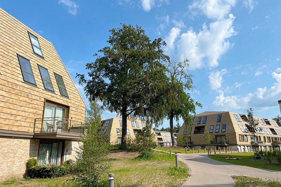
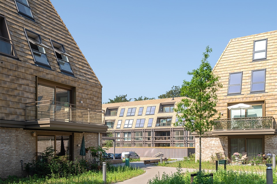
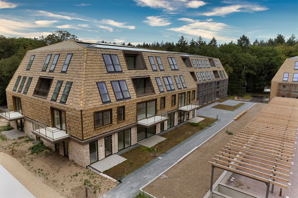
Seasons de Trappenberg is located on a green site on Crailoseweg, in the heart of the Goois Nature Reserve. On the site of the former rehabilitation center, 270 lifetime-ready rental apartments were built for residents over the age of 65. The project consists partly of new construction and partly of renovation. SVP Architectuur en Stedenbouw designed the new construction, and Koopmans Bouw is carrying out the work. The staircases and landings are supplied by Steenhuis Beton from Uithuizermeeden in Groningen.
Steenhuis Beton was involved in the project from an early stage and began work on the building’s structural shell, explains sales manager Aeilco Holtkamp. The focus: the new construction portion of the project. In total, Steenhuis Beton supplied 80 staircases, 19 of which included connected landings. The staircases are standard designs: straight staircases, produced using Steenhuis Beton’s own molds. “We have several hundred standard molds. We chose to use those for this project as well. That always works best for us.”
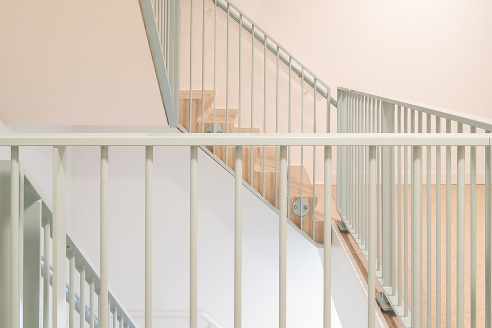
What made this project special was the color, not the shape. Concrete is usually gray, but here it was given a sandy color. “That was the architect’s request, to better blend in with the surrounding area. The soil here is all sandy, which is why he wanted to work with that color.” De Trappenberg is located in the outskirts of Huizen, in the woods. “As a result, the appearance of the stairs will also blend perfectly with the natural look of the surroundings.”
Steenhuis produces all its concrete in-house, from design to pouring. A non-standard color requires additional coordination. “Normally, the concrete-making process just flows naturally. In this case, you have to get the color just right. First, you have to agree on the right color, and then you go ahead and make it.”
For Steenhuis, this project was familiar territory. He really liked the combination of standard forms and a custom color. “It’s still nice that there’s a challenge involved, in the form of the non-standard color.” And it’s precisely that color that makes all the difference for the site. “It’s turned out to be a really beautiful building, with stairs and landings that blend seamlessly into the surroundings. It’s a nice change from the usual gray.”